When Nostalgia Backfires: Cracker Barrel’s Rebrand Misstep and a Design Lesson in Heritage
In August 2025, the minimalist logo—stripped of its beloved “Uncle Herschel”—was met with backlash.
STUART, FL, UNITED STATES, September 9, 2025 /EINPresswire.com/ -- Cracker Barrel is a well-known client to Lexy Rubin, owner of Rubin Design. She worked closely with the company in 2010 when they launched their private label candle line, Dilly Dally, designed to compete with Yankee Candle. At the time, Lexy was at NYC design agency Beardwood & Co., led by Creative Director Sarah Williams.“I recall visiting Cracker Barrel stores which was familiar to me anyway since I grew up in South Florida, and they harbor many stops along I-95,” says Lexy.
Fast forward to August 2025, when Cracker Barrel’s attempt to modernize its identity under CEO Julie Felss Masino quickly spiraled out of control.
“A rebrand of this magnitude, where customer loyalty is at the culprit of its success, is very risky, especially for large companies such as Cracker Barrel. I think of the big flop with Tropicana’s rebrand, who also quickly reverted back to its original packaging,” Lexy says.
“I felt the type treatment of the rebrand was done well, however it was still too simple. The barrel shape of the logo was not a strong enough push, or recognizable enough for the rebrand, and certainly needed more attributes,” Lexy says.
The chain unveiled a minimalist logo—dropping its beloved “Uncle Herschel” figure—in hopes of attracting younger diners. Instead, many saw it as a sharp break from Cracker Barrel’s Americana roots. Over 6,000 signatures poured into petitions, prompting the company to issue a public apology. Leadership pledged to preserve core traditions—rocking chairs, peg games, and Uncle Herschel—while reinstating the original logo. The stock rallied shortly after, recovering much of its initial drop.
The Real Lesson: Emotional Equity in Design:
Brand strategists quickly pointed out the danger of severing emotional ties with loyal customers. Rebrands that lack continuity risk alienating the very patrons who keep a company thriving. Experts pointed to Walmart’s gradual, heritage-respecting refresh as a better model.
“If Rubin Design was tasked with the rebrand, we would have taken a similar approach to Cracker Barrel’s private candle line, Dilly Dally, and not make too many drastic shifts in the branding and packaging. We would have refined Uncle Hershel and the typeface to have a more simple, cleaner look, without removing the integrity and authenticity of the brand. Just like the candle collection, it was my goal to maintain the American roots of the brand; simple country living lifestyle that Cracker Barrel customers know and love, with the whimsical illustrations and vintage typography, fit for a contemporary market,” Lexy says.
“Sometimes when you work with large design agencies from major cities, although they have the top talent and expertise in the design industry, they will still lack an understanding of a brand such as Cracker Barrel, unless you go there and really live it and understand that audience. And that takes time and research,” Lexy says.
A Bright Candle from the Past: Dilly Dally
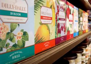
Long before the rebrand crisis, Cracker Barrel had embraced nostalgia in its design approach. In 2008, Beardwood & Co.—with Lexy Rubin as design lead—launched Dilly Dally Candles, an exclusive line for the Cracker Barrel Country Store. The collection included candles, votives, reed diffusers, and car fragrance papers, all wrapped in ornate, nostalgic packaging.
The Dilly Dally identity was steeped in Cracker Barrel’s heritage: warm, illustrative, and comfort-driven. Unlike the 2025 redesign, it felt timeless and authentically Cracker Barrel. Customers connected with its hand-drawn fonts, vintage-inspired motifs, and country-store charm.
The success of Dilly Dally highlights key lessons for heritage brands:
- Anchor modernization in nostalgia: Preserve key identity elements while refreshing for new audiences.
- Design as emotional storytelling: Every curve and color builds connection—something the 2025 logo stripped away.
- Gradual evolution over reinvention: Continuity strengthens customer trust.
- Packaging as brand diplomacy: Visuals communicate legacy and values more powerfully than words.
Cracker Barrel’s rebrand misstep is a reminder that emotional equity is often more valuable than a sleek typeface or modern shape. As Lexy Rubin reflects, the Dilly Dally project’s success was rooted in empathy, authenticity, and a deep understanding of the brand’s audience—qualities that heritage companies cannot afford to overlook.
Lexy Rubin
Rubin Design Co
+1 772-208-7547
email us here
Visit us on social media:
LinkedIn
Instagram
Facebook
YouTube
Legal Disclaimer:
EIN Presswire provides this news content "as is" without warranty of any kind. We do not accept any responsibility or liability for the accuracy, content, images, videos, licenses, completeness, legality, or reliability of the information contained in this article. If you have any complaints or copyright issues related to this article, kindly contact the author above.

